Design and use of definable graphical dashboards
Introduction
The document describes the possibilities of configurable graphical dashboards in the application. Using them, the user can create their own views that will contain the elements of their choice. These elements can be of various types, e.g. charts, tables, tiles, etc.
Purpose of the task
The goal of this tutorial is to build a sample dashboard from the data that is in the system. It should be taken into account that the data itself is exemplary and the purpose is only to present the working method and capabilities of the system. Always refer to the AMAGE system user documentation for full functionality knowledge.
Implementation
We start by preparing the data. In this example, we want to create a new dashboard that will present the current progress of items supervised in the system. The data comes from the Supervision module and the designed dashboard elements will use this data
Creation of two dashboards
First, we create two dashboards. We create them to show how they can be grouped and included in the application’s main menu in different ways. Let’s say we will create the "Assembly progress" and "Delivery progress" dashboard.
| We have resources, supervision templates and initialized supervision in the system that correspond to this type of data, so we will not create new data, but will use those that are available. |
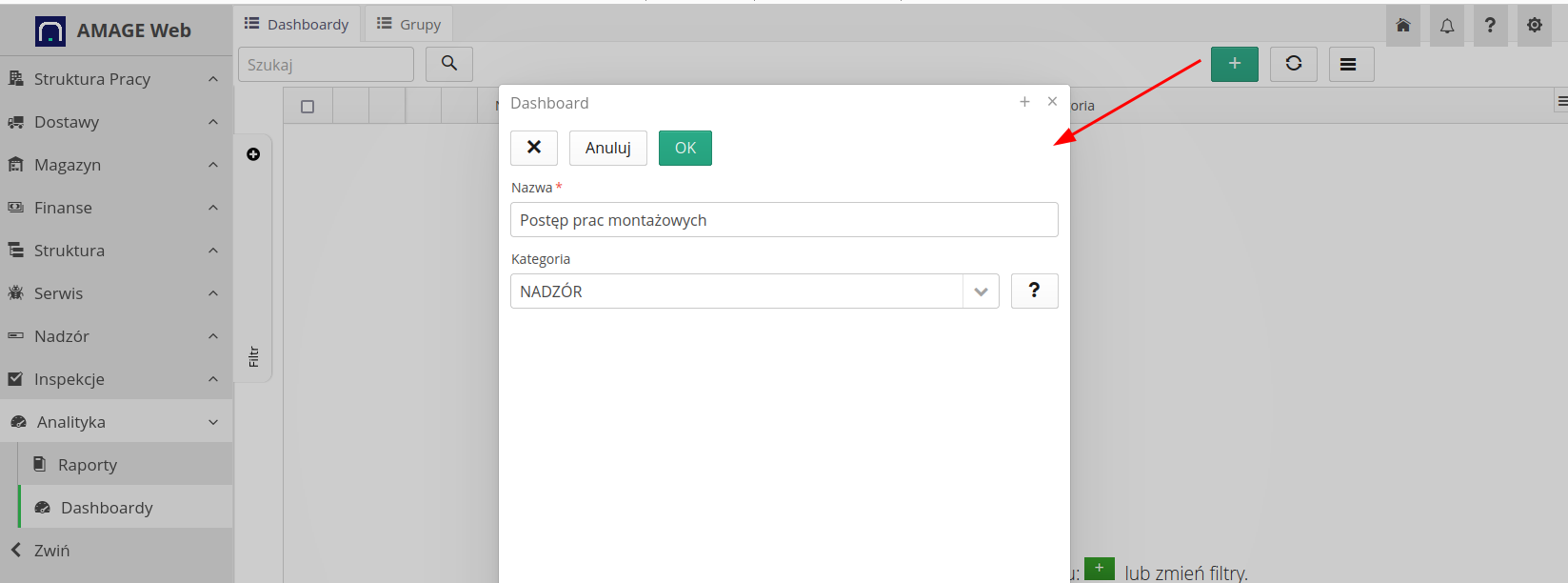

We create two dashboards, give them names and can categorize them in the "supervision" category. If we have a lot of dashboards, it is worth categorizing them to facilitate later navigation. We save the data.
We can move on. We create dashboard groups.
Creating a group and adding them to the main menu of the application
Dashboards are panels with data. However, we have often noticed that this data is often quite complicated and contains a lot of indicators that are further divided into certain data areas. Therefore, it would be good if the user could create several such panels and display them in one view. This is what dashboard groups are for.
| Note that a group consisting of one dashboard is also a group. The system detects this and then displays only this one dashboard without additional tabs. |
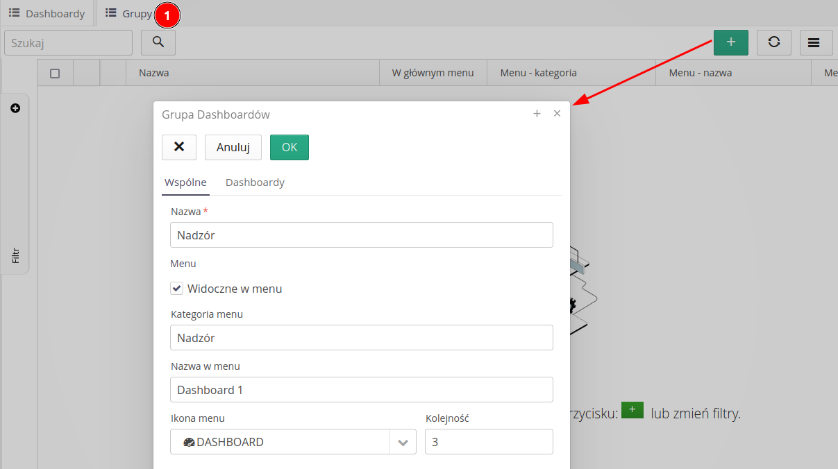
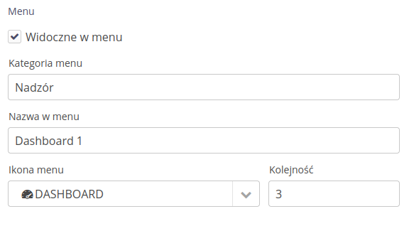
By the way, we take advantage of the fact that a group of dashboards can be connected to the main menu of the application. This way, the user will be able to quickly go to the selected dashboard. Using this method, we can also make dashboards available in individual sections of the system, so that the user can find them in the place where they use, for example, the service module.
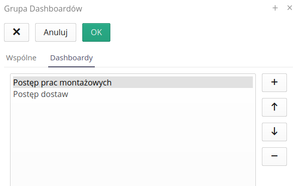
We add our designed dashboards to this group.
We can move on to designing the appearance of the dashboard.
Designing a dashboard
We go to the list of dashboards, select the dashboard we are interested in and select the Design action.

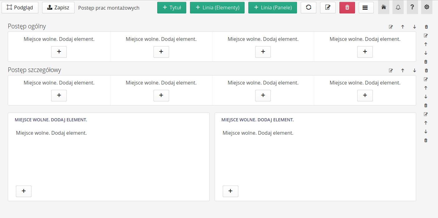
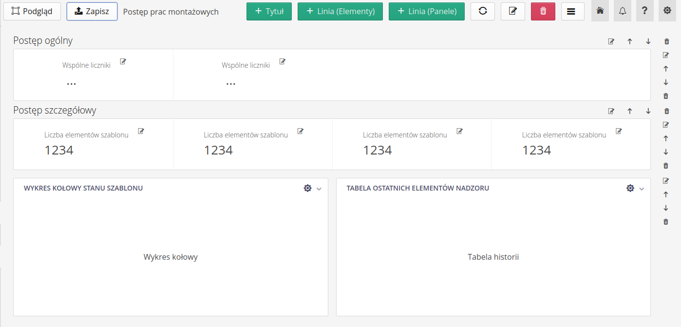
We go to the dashboard designer. We start creating the appearance of the dashboard. We can choose from three main components (lines) that create the main structure of the dashboard. These are:
-
Title - an element that displays the title of the dashboard. It is mainly used to separate different areas of data.
-
Line of elements - an element that allows you to place several so-called elements in one line. tiles. Tiles are simple elements with numerical data. We usually store some numerical information here, such as summaries or counts. The tile consists of a title, a numerical value and, optionally, a small chart indicating the so-called data trend. spark. Additionally, there may be buttons available in this area that will redirect you, for example, to the history view of a given parameter or a chart generator.
-
Panel line - an element that allows you to place several data panels in one line. A panel is a more extensive element that can contain various elements such as charts, tables, tiles, maps, etc. Panels can contain data that is more complex and takes up more space than a single line of elements.
In our case, we select several titles, one supervision summary line, and one line with supervision data divided into two panels. Importantly, the line configuration allows us to decide whether we have one tile or four in one line. Here we decide on a line with three tiles and two panels in a line.
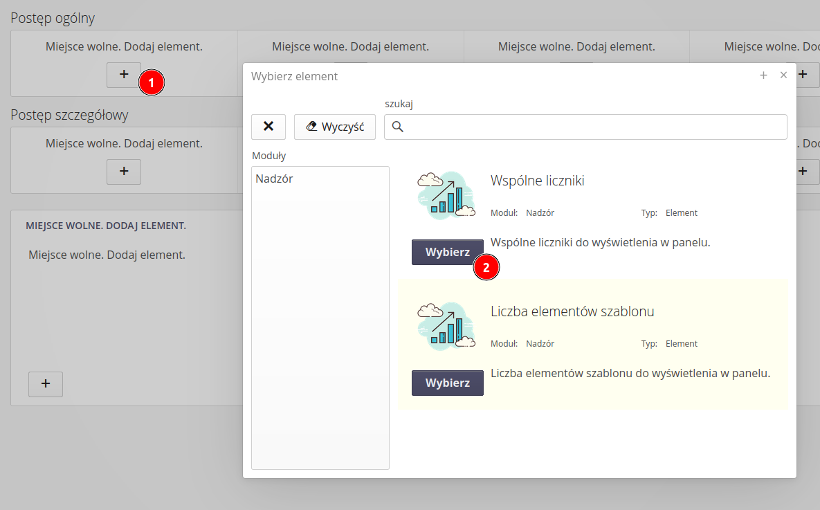
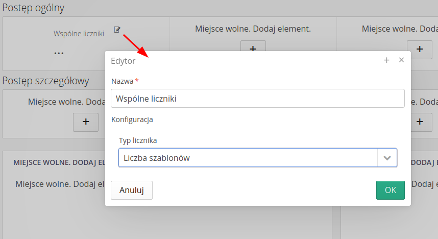
We proceed to filling in the data. Each line has the so-called places to which we can add content directly from the designer view. Select the '+' button and select the item you want to add. In our case, we add elements related to the supervision module. After adding each element, the configuration of the given element is displayed. Here we can define what we want and how to display it.
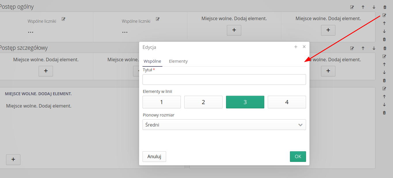
We save the entire configuration. We finish our work and can start viewing the dashboard and seeing how the data looks like. We save it with the Save button and then select the preview with the Preview button.
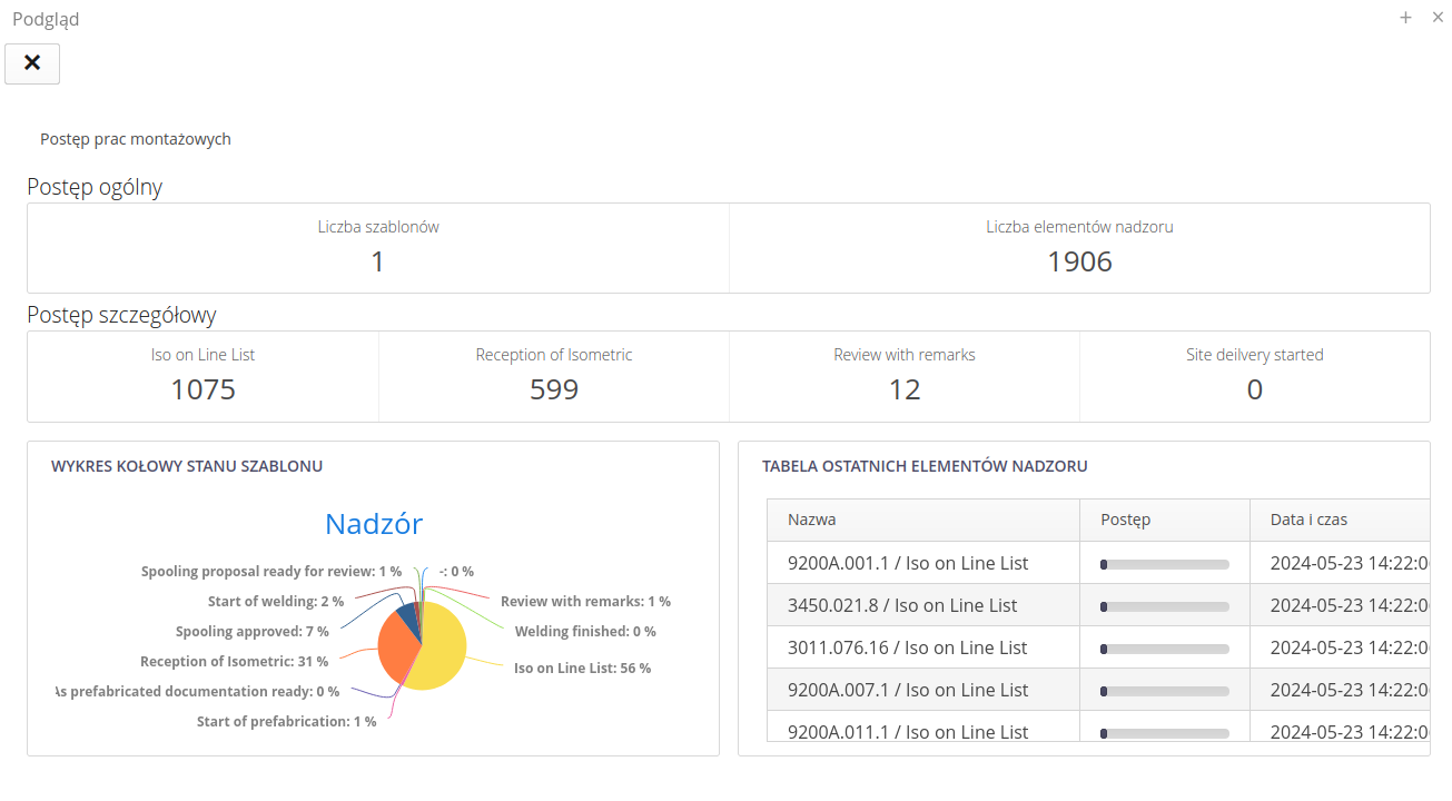
If the data doesn’t look the way we want, we can go back to the designer and change the configuration. We can also add new elements, remove old ones, change their configuration, etc. Complete freedom. After saving the dashboard, it is also available to users in the appropriate system menu where we placed it. As you can see, the dashboards form a group and our dashboard together with the second designed one create a group of tabs after entering this view.
Summary
In this tutorial, we showed you how you can create your own dashboards in AMAGE. It all starts with creating a new dashboard and then designing it. In the project, we can use various elements that are available in the system. We can also create dashboard groups that allow displaying several dashboards in one view. We can also add groups to the main menu of the application to make it easier for users to access selected dashboards. It all depends on our needs and requirements.
More information
-
Dashboards Documentation - user documentation
-
List of available dashboard elements - list of dashboard elements available in the system