Data analytics
Data analytics
The reporting and data analysis module allows access to predefined reports available to system users from one central point and access to Dashboards used to design graphic panels with information. The reports module is available in the main menu in the Analytics section. It contains links to the list of reports, their generators and the dashboard designer.
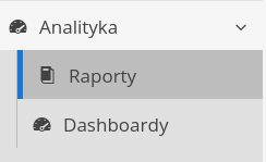
Reports - report viewer
After selecting the reports section, a list of reports is displayed. The list of reports is divided into individual sections that are a grouping element of reports from particular functional areas of the application.
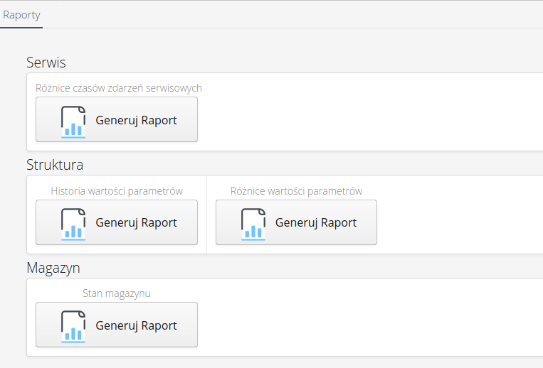
| The list of reports depends on the modules available to the client. Depending on the active functionalities, the list of reports varies. |
Depending on the mechanism for triggering the report, different visual elements are presented. If we select a report or decide to configure the report tab, a report preview and data visualization window is displayed.
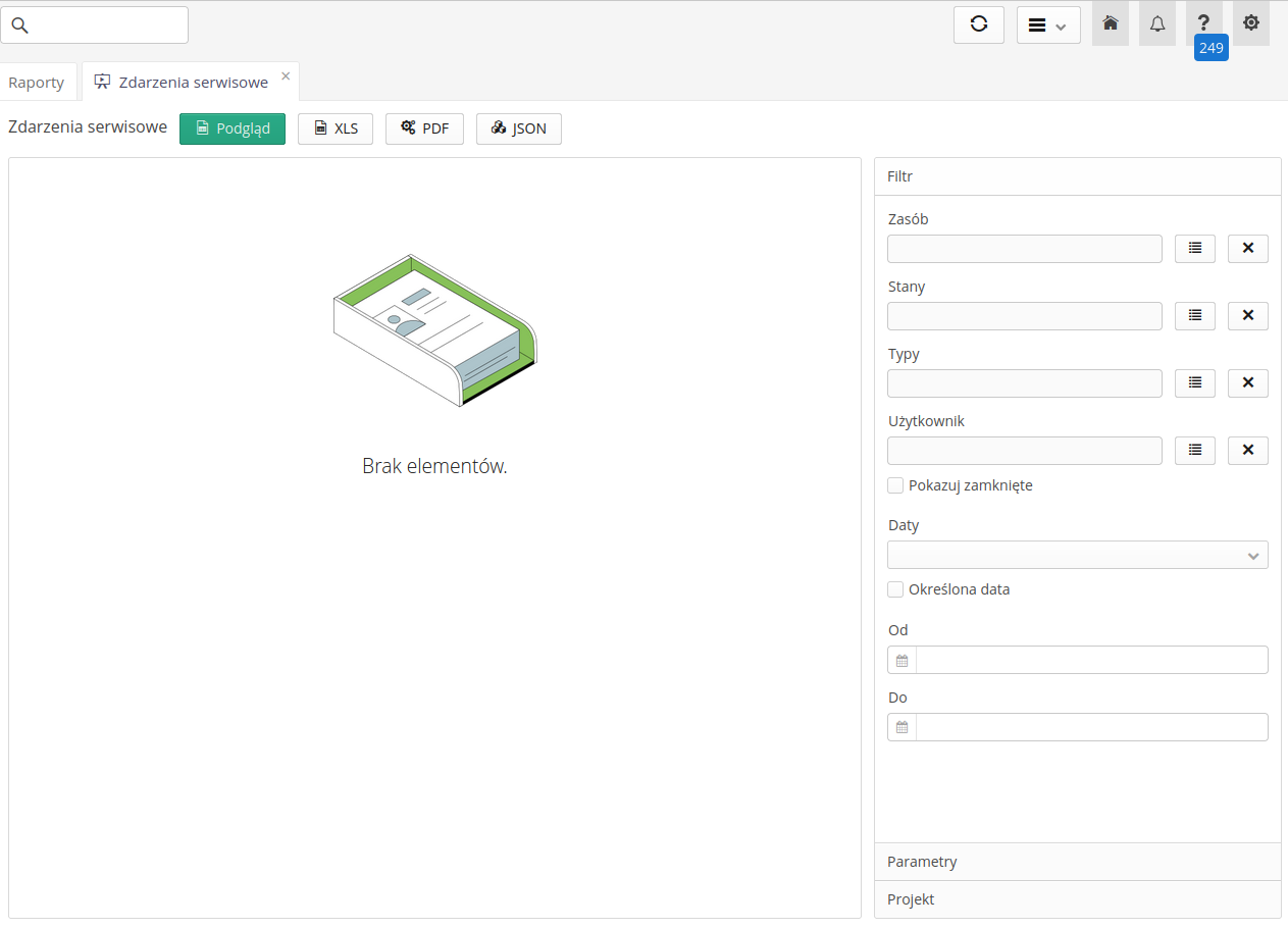
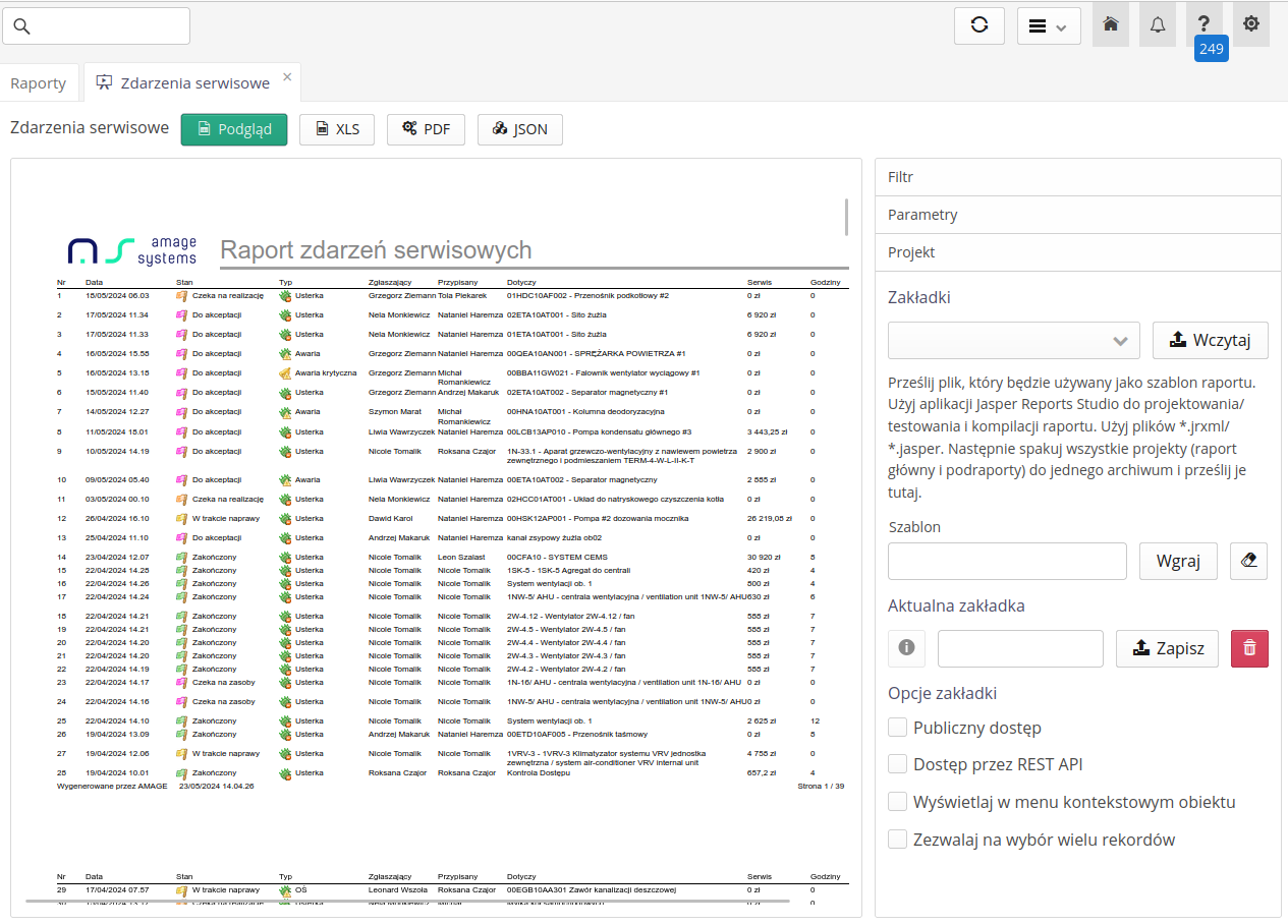
The preview allows you to display the generated report and export it to XLS, PDF and JSON formats. Using this preview, we can also modify the data and the way the report is presented. On the right side there are panels that allow you to:
-
Filter - filtering the current view. Each report provides its own filtering list, which allows you to adjust the displayed data to the user’s needs.
-
Parameters - using this panel, you can send additional properties and data to the report generator. For example, you can send permanent data this way, e.g. project name, customer ID, etc. All parameters are transferred to the report generation engine.
-
Project - report project with which we can change the appearance of the report, upload our own template or save/read data from the report tab. Here we can also define options for the generated report, such as making the tab available to all system users, enabling access to the report via the programming API or adding the report to the context menu of objects in the system.
Preview allows you to generate report data as HTML data and display it directly in the application. This way we can see the appearance and presentation of report data.
Report filter
A filter is available when generating reports. It is also presented in certain places in the system that are used for quick report generation. After selecting any report, the report filter definition window is displayed. It is specific to each report. The data displayed there allows you to narrow down the data displayed in the report and, for example, how to group data, if the report provides such functionality.
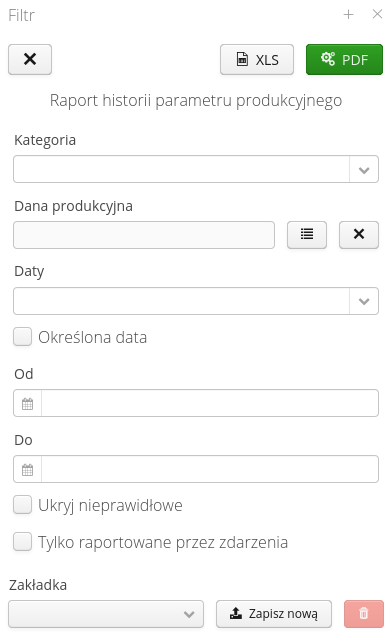
After filling in the data, the user can choose the target object that will be generated with the report data - a PDF file or an XLS (spreadsheet) file with the report result. If a PDF file is selected, the file is generated on the server and made available through the system’s built-in viewer. A separate tab is created for this in the report list view. This allows you to generate multiple reports of the same type with different initial data and then analyze them.
| In the case of XLS-type downloads, the system provides such a report via a pop-up file. Please pay attention to whether your Internet browser blocks such pop-ups. |
Customizable reports
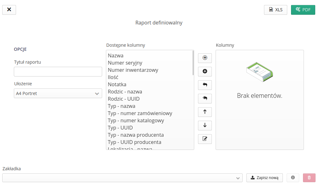
The ability to generate reports with predefined columns and for users to determine their order, visibility and size has been added to the system.
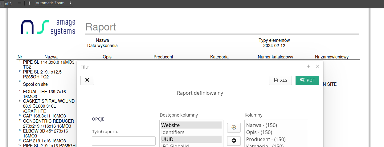
Definable reports are visible as reports with a dark background in the report selector. They allow you to choose the format of the report (A4/A3), its orientation and define the columns that should be included in such a report, their order and width. Such a configuration can, of course, be saved as a report tab and generated automatically later.

Reports definable from views
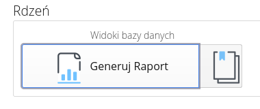
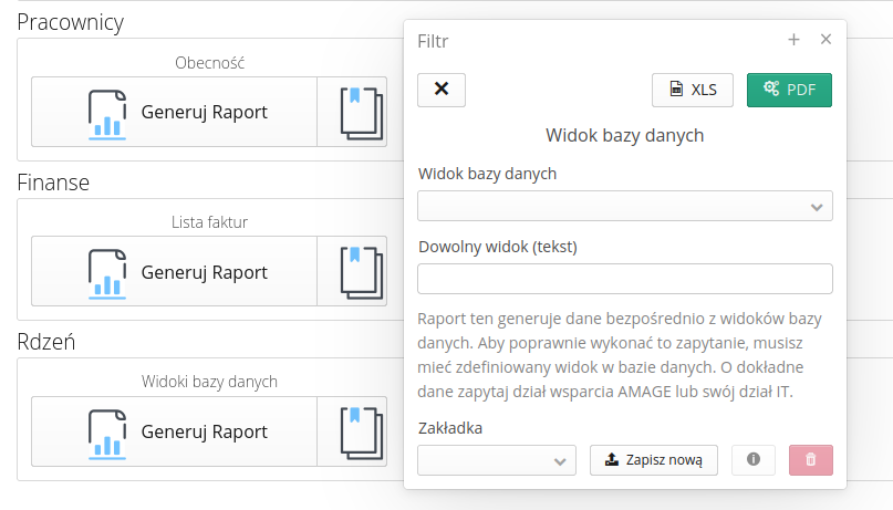
The ability to generate customer-specific reports has been expanded. Sometimes the functions available in the system do not enable the generation of reports that exactly meet the customer’s expectations. Using this function, we make it possible to provide users with a report based on database views that are prepared specifically for this implementation.
Views are generated by AMAGE implementers or by users of On-Premises systems after reading the system documentation. The resulting report is a PDF/XLS report corresponding in content to the contents of the database view.
| For corporate users, documentation of the database schema with descriptions and table connections is provided. Users can create views themselves in a specific database space. |
Bookmarks
Reports allow you to define report tabs. Bookmarks allow you to save the settings selected in the filter for re-filling without having to select all parameters over and over again. The tab also allows you to define a dedicated report appearance. This allows you to change the appearance of the report when it is generated (e.g., a different appearance of the report due to formal needs, customer, etc.)
The definition of bookmarks is always available at the bottom of the filter. The checkbox allows you to select a configuration from already saved tabs. The create new button saves the bookmark with a new user-defined name. Delete allows you to remove a bookmark from the list.

| Further definitions of tabs including appearance can be made in the system configuration section. Please refer to this scope if you need to upload a new report template for a selected tab. |
Report preview and generation
After selecting the 'Preview' button, the system generates a report according to the settings and presents it directly in the application.
Using the XLS, PDF and JSON buttons we can generate report data in the appropriate format and presentation. When the report is generated, it displays an information window regarding the generation.
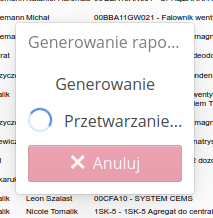
Once generation is complete, the file is made available to the user.
| Please pay attention to browser security. Files are transferred to browsers and some browsers may block the display of (pop-up) attachments. Please set the app permissions in your browser accordingly to enable this. |
Report types
Reports in the system have different data sources and are generated in different ways. Below is a brief description of each report:
-
Dedicated reports - reports created for a specific purpose and contain detailed information and appearance (columns, summaries, groupings, etc.). They are available in the system and can be generated by users, but the user cannot change the content of the report apart from modifying the data filters.
-
Definable reports - reports with the ability to define fields that will be displayed in their order. These reports are presented with a blue background in the list. After turning on the report preview, we can select columns, their arrangement, width, etc. and filter the data. Then the report is generated from the list of all objects for a given report type.

-
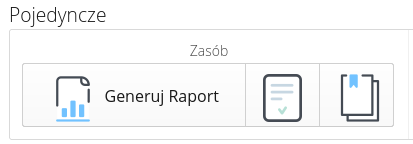
Individual reports - sometimes the user needs to generate data/form of a specific object, e.g. a resource. Using these reports, we can generate any report with data from a specific object. Usually, in this case, each report has its own specific appearance/design - these are reports such as declarations, detailed analytical data, etc.
-
Specialized report - reports that enable the generation of data from various additional sources. Such a report is, for example, a report on data generation from views in the database. This allows you to develop special queries based on the AMAGE database and generate a report directly from the results of such a query/procedure. This allows you to generate reports that are not available in standard system reports. These reports are marked green on the list.

| Each report has its own specific settings and generation options. Depending on the report, various options and configuration possibilities are available, but each of them has the ability to change the appearance of the presented data. We design the appearance of reports using the free Jasper Report Studio application, which allows you to freely customize the appearance, graphics and presentation method. |
Dashboards
Dashboards are graphic panels. In the documentation, we will refer to them by the English name Dashboard, because it is often used in publications and is widely known. The application allows you to create and manage any number of dashboards and dashboard groups.
| In addition to definable graphic panels, the application also has a number of permanently predefined graphic panels. Ultimately, they will be replaced with the ability to generate such dashboards by users. Until then, predefined graphic panels will be available in the system in parallel with the new ones. |
Dashboards are available in the main menu of the system in the Analytics section.
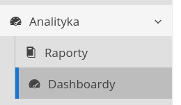
After activating the actions available in the dashboard menu, a list of available dashboards is displayed. We can view, edit, delete, add new ones and group them into dashboard groups.
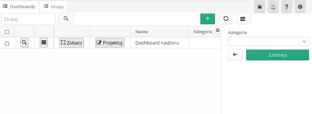
After creating a dashboard, actions are available in the line that allow you to manage dashboard elements.
-
View - allows you to preview the dashboard
-
Design - goes to the dashboard designer
-
Details - allows you to edit the name and description of the dashboard
Creating a new dashboard is done using the + Add button. A form appears allowing you to enter basic information about the new dashboard.
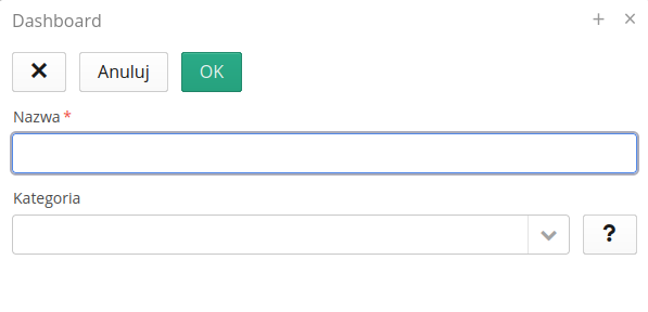
The most important form fields are:
-
Name - name of the dashboard
-
Category - the category to which the dashboard is assigned. We can group dashboards into categories to make them easier to find later.
A dashboard group is a collection of dashboards that we want to associate with some functional area of the system. They allow you to group several dashboards into one view, in which each dashboard is a separate tab. Using groups, we can also enter a dashboard group as a separate entry in the application’s main menu.
The list of dashboard groups is available as a separate tab in the dashboard view.
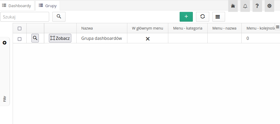
For each created group, we can preview and edit parameters through the menu items:
-
Details - allows you to edit the group name and description
-
View - displays a group of dashboards in a separate window
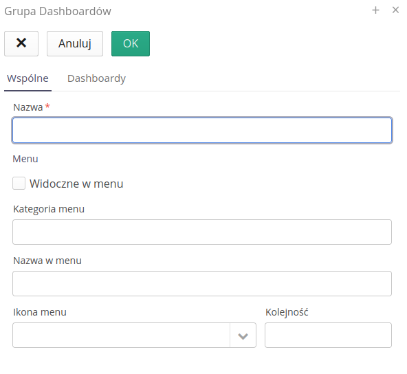
The form for adding a new dashboard group allows you to enter basic information about the new group.
-
Name - group name
-
Visible in the menu - ability to display a given group of dashboards in the main menu of the application
-
Menu category/Name in the menu/Icon in the menu/Order - elements that allow you to place a given group of dashboards in the main menu of the application in the appropriate place (menu group), with a name and your own icon
-
Dashboards - list - a list of dashboards that belong to a given group
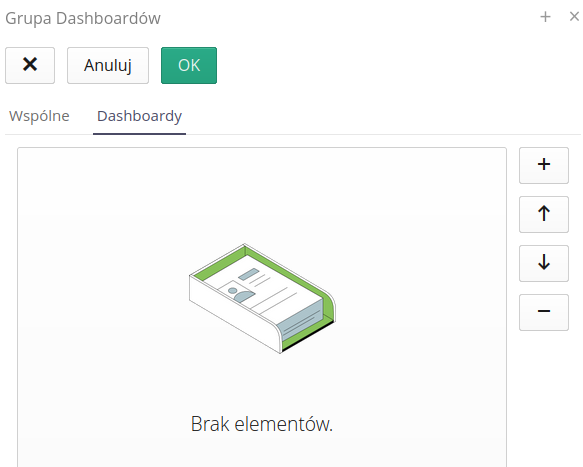
After adding dashboards to the group, we can also determine their order in the group using the `Up' and `Down' buttons.
| In a specific case, a dashboard group may consist of one dashboard, which is then presented as a single panel in the application’s main menu, rather than as a tabbed view. |
Dashboard design
Dashboard design is done using the built-in dashboard designer. It allows you to add new lines, panels, tiles and edit their properties. Go to the dashboard designer using the `Design' button available in the dashboard list.
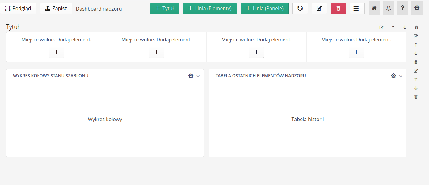
After entering the dashboard designer, we have access to a panel with elements that we can add to the dashboard. The actions available in the main view section are:
-
Preview - displays a preview of the given dashboard being designed. It allows you to see the effects of changes in the project. ATTENTION. Changes are not saved automatically and you must save your configuration changes before previewing.
-
Save - saves changes to the dashboard configuration + Title - adds a new line with a title + Line (Elements) - adds a new line with elements (tiles) + Line (Panels) - adds a new line with panels
After adding a horizontal element - a title, elements or panel lines, buttons controlling individual lines appear on the right side of the view.

-
Edit - editing line properties
-
Up - Moves the line up
-
Down - Moves the line down
-
Delete - delete a line
In each line of the elements/panels type, there are places to complete the data, i.e. enter elements. Each of them has a button that allows you to directly add a specific panel or element of content to a given place.
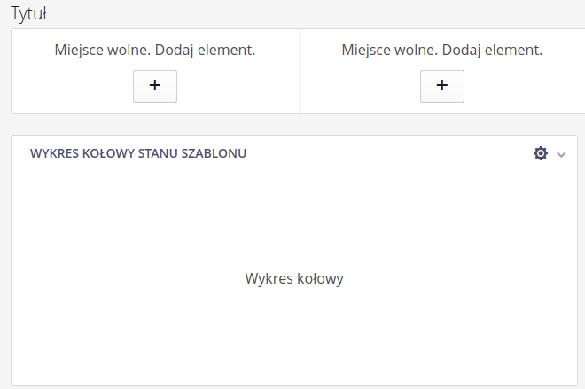
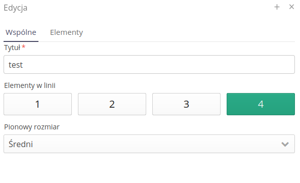
If we select line properties from its side menu, a dialog appears with information allowing us to adjust/edit the line’s data and properties.
-
The title - the title of the line - does not appear in the dashboard, but allows you to identify the line in the configuration
-
Elements in a line - the number of elements in a line - from 1 to 4. They allow you to set the appropriate number of elements in a line.
-
Vertical Size - The vertical size of the line. It allows you to choose from three predefined heights depending on the selected elements/panels.
-
Element list - list of elements in a line. It allows you to add, remove and edit elements in a line.
We can add the element directly in the line properties or directly from the dashboard view using the + button. A window appears that shows all available tiles/panels in the system. We can select the appropriate panel/element and add it to the line.
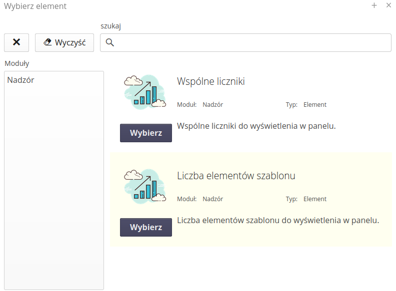
In the view, we can browse the data and the panel consists of:
-
Search - sections allowing you to search through available items
-
Module list - a list of available modules that contain elements
-
Selection list with description - list of available elements with description. Using the
selectbutton, we add an element to the line.
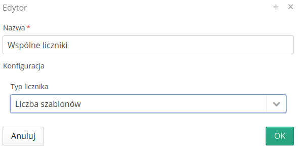
After adding, the tile properties window appears automatically. It allows you to edit the properties of the tile. Tiles/Panels have various properties that can be edited and the appearance of the panel can be customized to the user’s needs.
When designing a dashboard, you can quickly preview the appearance of the dashboard using the Preview button. After selecting it, an additional window with a dashboard preview appears. The data is loaded according to all filters and presents the actual information collected by the dashboard.
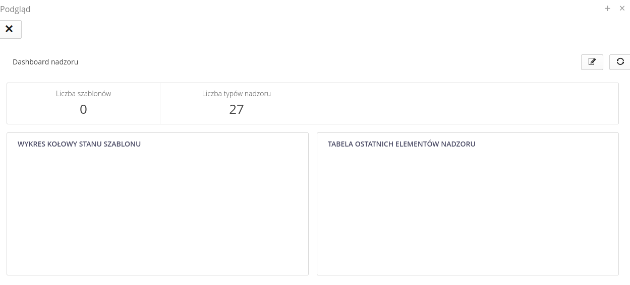
After saving the dashboard, you can see it in the dashboard list and in the main menu of the application. For more information about dashboard design, visit the AMAGE academy in the use cases section.
Dashboards - tiles
Dashboards in the AMAGE system allow you to present data in the form of tiles and panels. Below are the described functions and available tiles in the system depending on the available modules.
| Depending on the available modules, different tiles are available in the system. Below is a list of all available tiles in the system. |
Supervision - tiles
The supervision module allows for the presentation of data in the form of tiles regarding supervised elements and processes/supervision templates.
(Element) Common counters
A tile showing general supervision information for all items. You can view the number of all supervised items, templates, etc.
(Element) Number of template elements
A detailed tile showing the number of items in a given supervision template. We select a supervision template and a specific supervision state, and the system displays information about the elements in this state.
(Panel) Supervision status pie chart
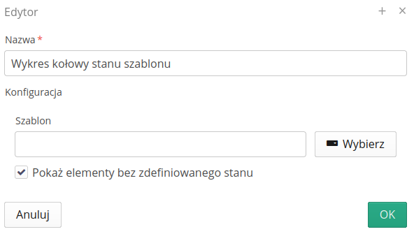
A panel with a pie chart showing the control status of elements for a given template. It allows you to visually present data about the supervision status of elements. Options allow you to:
-
Template - selecting the template to which the analysis applies
-
Show elements without a defined state - allows you to also display elements assigned to a given template that do not yet have a registered state
Inspections - tiles
Tiles for the inspection module
Employees - tiles
Tiles for the employee module
Inspection Rounds - tiles
Tiles for the inspection round module