General
General
Starting data and initial definitions. Login, initial events, and access to help.
Launch information
When the application is first launched by the user, it displays a welcome screen to the user. The text informs about the application and wishes the user a successful use of the application.
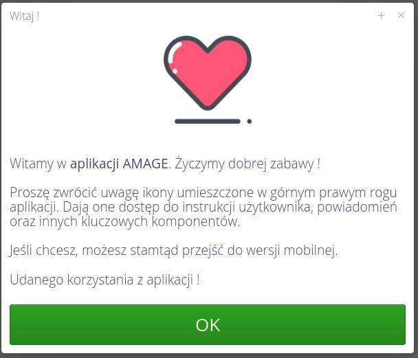
In addition, depending on the user’s privileges and system properties, it displays appropriate messages about the availability of other types of interfaces. If the user has permissions to access the Mobile, Desktop section then depending on the login to the section, the system reminds about the existence of another version of the interface and indicates where to switch between interfaces.
| The launch message appears only once. Once you accept the message, it will not be displayed again. |
If a user logs in without his or her first and last name, an additional message appears in the welcome window asking for this information.
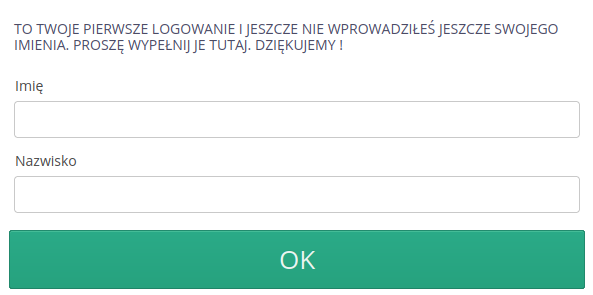
| This case occurs, for example, when a user has been invited to the system only with an email address. Data in this case have not been entered. |
Application versions
For simplicity, the documentation will use abbreviations for the names of individual application sections or entire systems. Below is the list and its explanation:
-
Mobile - mobile interface of the AMAGE Web application - available when the user logs in to the application using a phone,tablet or enforces this mode by selecting the phone icon in the system bar of the application
-
Desktop - application interface designed for larger screens - for devices like desktop, laptop, etc. At login if the application detects the availability of such a screen it automatically loads this interface first.
-
Config - a special system configuration interface available to users who have permission to access the system. It includes the ability to define users, permissions and configure system automation
-
Desktop Legacy - AMAGE Desktop legacy application in the form of an exe installer for desktop computers. Some users of the system use or have used this application. Sometimes in the documentation of this system we refer to the functionality available in that version of the system.
License and additional information
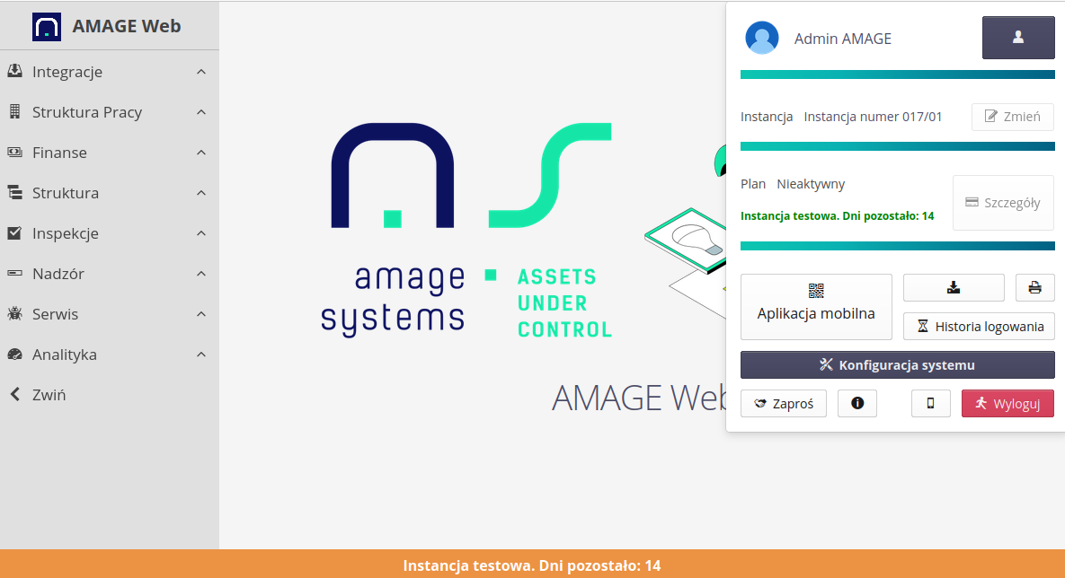
If the system instance is a test instance (e.g. an additional test instance for training/functionality verification), then when logging into the application, information about working on a test instance is displayed and a bar informing about working on a test instance is always displayed at the bottom of the screen.

For systems without trial time, a standard message is shown.

In the case of a time-limited version, information about the validity period of the license/temporary version appears in the bottom bar and in the tool menu.
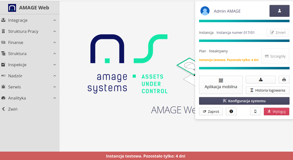
The system also informs when there is no license for an instance, when a license expires, etc.
| The system additionally notifies all system users of such a situation one month before the license expires via a system notification (in the lower right corner of the application window) every time they log in. |
Logging
Depending on the settings, the application has the ability to authorize using different sources. The supported mechanisms are: internal authorization, authorization via an LDAP server or authorization via an external OAuth2 system (e.g. Azure Active Directory/Oauth).
The primary method of authorization is through passwords stored in the main database. This allows authorization of any user based on comparison of the entered login data with the internal representation of it.
| The login method depends on the system’s implementation settings and is not modifiable by the user. The minimum parameters of passwords necessary for login (length, characters used, etc.) are set in the implementation configuration. The system allows for the existence of local and corporate user accounts (authorized in an external system) at the same time |
Opening the main address of the system in a web browser will present a basic login window in which you can enter your login and select the language of the application interface.
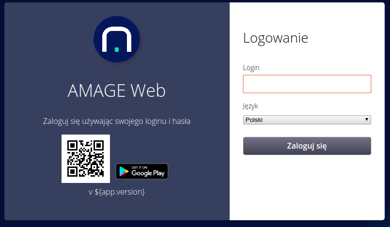
| The system is not case-sensitive for logins. Logging in with Admin, ADMIN or AdMiN login will have the same effect. |
Based on the entered data, further user authorization is carried out. If the user is a local user, a password entry window is displayed. In the case of corporate users with an external authorization system, the user is redirected to that system and then returned to the AMAGE system and authorized based on the data received from that system.
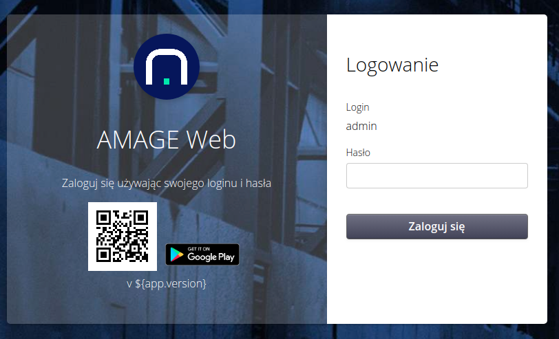
| It is possible to change the appearance of the login window within the scope of the AMAGE system. It is possible, based on the provided views, to modify the appearance of the login window to the visual standard for the enterprise. This is realized during the implementation procedure. |
Enterprise Login
Systems configured for corporate login use external systems for authorization - either Microsoft Entra ID systems or other authorization systems based on the OAuth2 mechanism. The AMAGE system allows local and corporate users to use one system at the same time.
This is what the initial login window is for. Here we provide the user’s login. If the user with a given login is a corporate user (does not have the 'Local User' flag enabled), the system redirects the login to the remote authorization system and after returning, logs the user in based on the data sent by the remote system.
In the configuration options, we can set information on how to automatically create corporate users, their initial settings and the definition of options for this type of authorization.
| For enterprise systems and initial login, the FIRST corporate user who logs in to the new AMAGE instance will receive super-administrator privileges. The condition is that there are no defined users in the system (including local ones). |
| The system allows you to link authorization mechanisms with many external authorization systems such as Azure EntraID. This allows you to enter employees of two different companies that use a corporate authorization mechanism. Configuration involves using AMAGE authorization servers and specifying the domains that are to be supported by a given authorization system. Depending on the user (domain), the system directs the user to different authorization systems. |
Main window and configuration data
After a correct login, the user is presented with the main window. Depending on the license permissions and the type of device (desktop, laptop or mobile device), a window is presented with an interface adapted to the capabilities of the device (screen size, resolution).
In the main menu there is an action to access the system menu. It is a button with a cog icon. This is a menu that allows you to perform additional system operations.
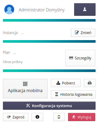
It allows you to change your settings, configure instances and payments (for versions of systems that support this functionality, e.g. AMAGE24) and perform additional operations.
-
User icon - access to configuration and uploading your photo/avatar
-
User button - access to user configuration
-
Instances - access to configure multiple instances and work on multiple projects.
-
Mobile App - go to the wizard to download and pair the mobile app with the instance.
-
Download - redirect to download the application installed on the computer with an interface to the AMAGE system.
-
Print - calling up a new window with the current view ready for printing
-
Login history - login history of the currently logged in person
-
System Configuration - access to the subsystem responsible for system configuration (users, access profiles, administrative actions, data imports/exports) - access only for users with access rights to this area.
-
Invite - a window to invite other users to the system by sending a link to an e-mail address
-
Information about the program - window with information about the program (version, type)
-
Mobile device - switching to the application view for mobile devices (force switching to this view)
-
Logout - logout from the application.
| The application takes into account a set of permissions to display information. By default, a user has no permissions to access system functions after logging in. The data to be displayed can also be restricted per object in the system, resulting in the visibility of only part of the data required for a given user. |
After selecting the Settings action, the information window of the user in question is displayed. It displays user identification information including first name, last name and email address.
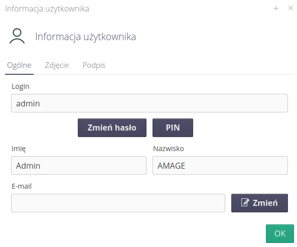
For local users, this is where the user can change the password. After selecting the Change password action, you are taken to the password change form. In this window, the user can also change the PIN code for devices working in offline mode (applications such as AMAGE Fx working in this mode). The PIN is a four-digit code that is used to authorize the user on such devices.
The user can also enter/change the current email address and upload a scan of his or her signature and photo. All these operations are available in this user’s background.
| The email address is used when sending messages from the system through the email mechanism. Failure to provide an email address will result in the inability to send notifications through such a communication channel |
| The electronic signature (scan) is used in documents authorized by a given user, which have the ability to generate their paper counterpart such as: order/delivery/check delivery. In this case, if the user has performed this action in the system then when generating a printout of such an order in PDF form, for example, the user’s signature will be included in the authorization place of this document. |
After selecting the action to change the password, the application displays a window with options to enter the current password and a new one.
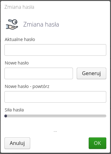
The password change window provides information on the strength of the password - this is due to the use of the appropriate types of characters found in the new password (upper/lower case letters, special characters, numbers). In addition, when checking the new password, other elements set in the password policy such as the minimum password length, etc. are verified. The user can use the "Generate" button to generate a random password. The password will be automatically copied into the appropriate fields of the form and displayed in an additional window. NOTE! Once the window is closed, it is not possible to display the given password in plaintext again.
| The password change window takes into account the system settings for password policy and validity. |
Access to online help
The application comes with its own help portal. This portal can also be accessed directly from the website, but is also built into the application adding several new features. Help in the system is available in several places, depending on the context, the selected system version and access privileges.
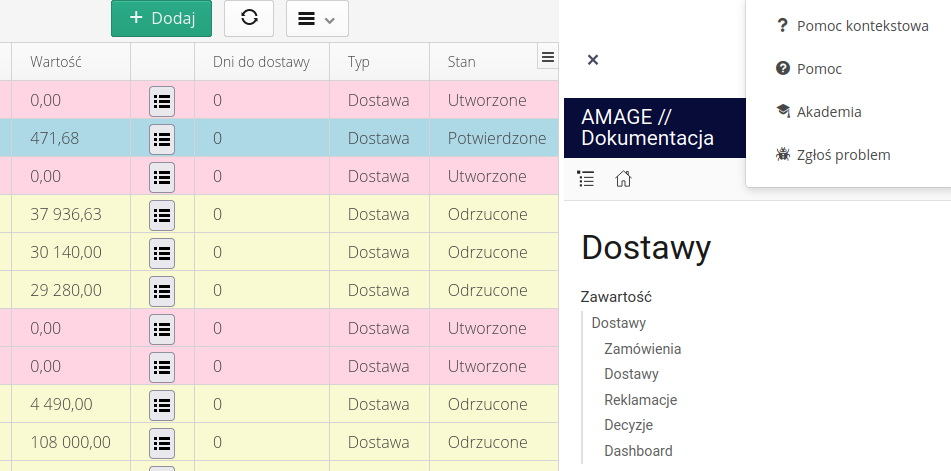
In the Desktop interface, contextual help is available in the system menu of the application (upper right corner of the window) under the question mark button. Selecting the action of this button displays a menu with options related to help.

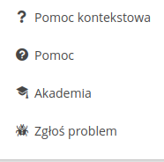
The help menu allows access to several options:
-
Context help - contextual help for the currently selected view is displayed in the side area of the application. If we are, for example, in the area of orders, the help will display information about this area.
-
Help - opening the main help window with the ability to navigate to any location and any instruction
-
Academy - opens a window with the portal of the Amage Academy. Dedicated section of the help portal with tutorials, examples and general information about the system.
-
Report a problem - calling the bug reporting interface to the AMAGE Helpdesk system
If new information appears in the help portal - messages or information about new system functions, an overlay with information about the number of unread information appears next to the help button.

When you select the help action, we additionally display information about unread messages and new features. Clicking on the numbers will open a pop-up window with this information and navigation.
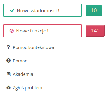
| Notification counters reset when you close the new feature/message view. |
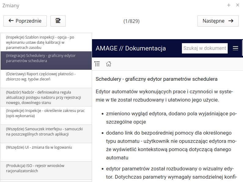
In the application element details view, there is an option to display a list of all presented information. After turning it on with the button, a list appears at the top of the screen, which allows you to go to the information you are interested in without having to go through all the elements in the change list.
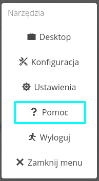
In the Mobile interface, help is accessed through a separate "Tools" menu. When this menu is selected, a view with options appears. Selecting "Help" will display context-sensitive help.
After selecting one of the above-mentioned actions, an additional window with contextual help content is opened. Help is specific to each type of application and view. If you open the help in the Desktop interface, it will display the documentation of that part of the system and with a list of functionalities specific to the system instance, e.g. leases, maintenance, etc.
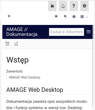
Buttons appear at the top of the window that allow you to view help in a pop-up window, navigate to the documentation or academy section, and additional portal/help/tutorial functions.
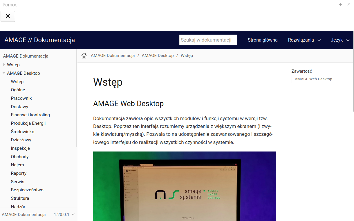
| In order to have access to this documentation, you must be online and have access to the Internet, in particular to the AMAGE servers responsible for providing documentation. |
If a user has permission to access the system’s configuration interface (user management, etc.), he or she gets access to the documentation portal, which contains full documentation of the AMAGE system - all types of applications, use cases, tutorials, change logs, etc. To access the documentation portal, go to the configuration interface (Config) and in it select the main menu "Tools" → "Help Portal".
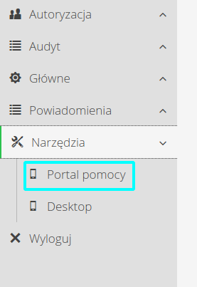
When this option is selected, user documentation will be loaded in the form of a help portal. You can browse the portal like any other website. The portal is divided into sections containing user documentation, use cases, instructions on how to use the various components of the system, and a programming API area (reports, etc.) that allows you to design reports yourself.
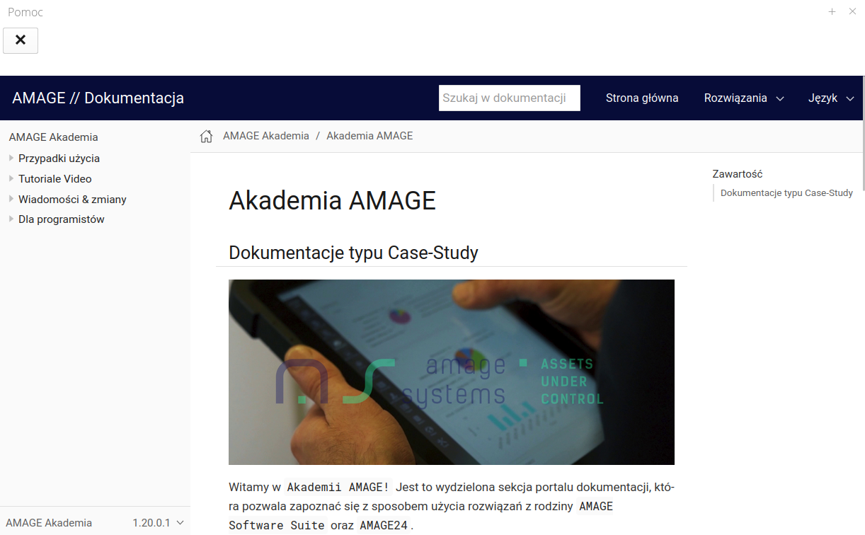
| The system documentation is continuously updated and supplemented. Releases of documentation updates are not necessarily synchronized with releases of major versions of the system. |
Context-sensitive help in the application
After selecting the context help action, we go to a specific place in the system documentation.
Common elements
Part of the functionality is common to all components of the system. In this section, we describe the common part available in different parts of the interface.
Main menu
The main menu in the application is located on the left side of the view. When it is opened, it is divided into areas and sections. Each selected section is displayed with an activity ticker.
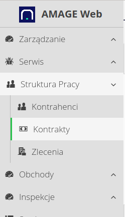
The menu can be collapsed to take up less space on the screen. This is done with the "Collapse" action available as the last menu item
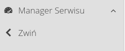
When this action is selected, the menu collapses to a sidebar with only the icons visible.

Appearance of tables - customization
Most of the tables presented in the system have the ability to customize their appearance. Such tables can be identified by the customization button available in the upper right corner (on the title bar).

After selecting it, a list of all currently visible columns in the table and an additional menu (actions) appear. The user can change the size of individual table columns (extending/shortening) their width. It can change the order by moving (drag & drop) the columns between them. Column visibility is defined in the context menu. After hiding a column, it becomes invisible and disappears from the list of columns available in the context menu.
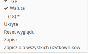
The user can for such tables:
-
Change the order of the columns
-
Change the width of the columns
-
Hide some columns (from the context menu)
-
Uncover already hidden columns
If the columns are hidden we can show them using the Hidden action. After selecting it, a window with a list of hidden columns appears and using it we can show the selected columns again.
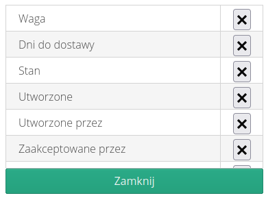
Additional items on the menu:
-
separator with the number of all columns available for this table i.e. including the hidden ones. If the table has an appearance configuration that has been loaded then an asterisk * additionally appears
-
Hidden - window with hidden columns
-
Appearance reset - all hidden columns are displayed, column width is set to default
-
Save - saves the configuration for the user who is currently logged in.
-
Save for all users - saves the default configuration for users who have not changed the appearance of the table themselves.
| The option to save for all users only appears for users who have super-administrator rights. User configuration always has priority over system configuration i.e. if there is no configuration the table looks as AMAGE designed it. If the administrator changes the appearance (save it!) then this configuration will be loaded for all users who have not changed the appearance themselves (and saved it !). |
Detail appearance - customization
The detail view of some objects, e.g. work orders, contains a lot of additional information in the form of a series of tabs. For systems with many modules, this resulted in a high density of this information, which was not always necessary for a given user. This change allows you to adjust the visibility of tabs, their order for yourself and globally for all users.
Two tabs appeared in the details view: More and Edit. They allow for two operations - view configuration and moving less frequently used tabs to the More grouping tab
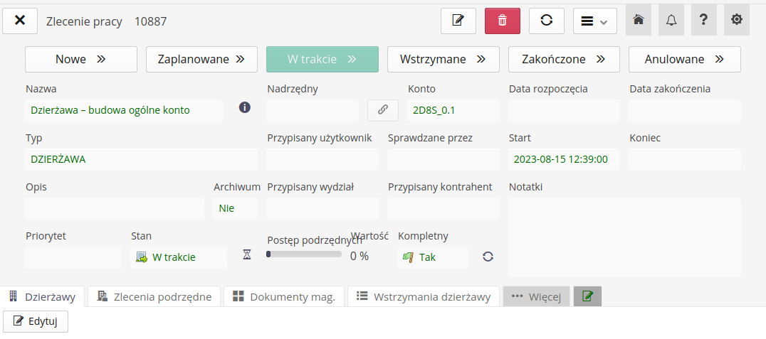
The tab-bar contains additional sections More and Edit.

The 'More' tab contains just those tabs that we have moved to non-essential tabs. After selecting it, an additional row of tabs appears and we can select them. They don’t clutter the main view, but are still available.

more tabThe tab visibility editor allows you to configure their visibility moving to three sections: Visible (always visible), 'More' (visible in the grouping tab) and Hidden, which completely hides a given type of data in the detailed view. We can also change the order of the elements in these two sections. The configuration can be saved for yourself or for all users.

The editor displays three groups of tabs:
-
Visible - visible by default
-
More - visible in the expanded data tab
-
Hidden - not visible in any of the places mentioned above
The buttons allow you to:
-
three dots - transfer to the 'More' tab
-
minus - transfer to an invisible group
-
plus - move to visible tabs
-
Up/down - change the order in which the tabs are displayed
Filters
Filters in the item list view allow you to specify additional criteria for narrowing the views. Filters are available in a side fly-out panel. When a panel is selected, it expands making the information in it available. Filtering allows you to specify additional search parameters. The filter will be applied when the Apply button is selected.
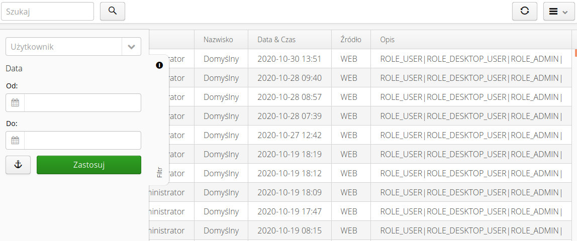
Using the "anchor" button, the user can dock the selected filter on the right side of the view. By selecting this button, the filter is docked and data can be filtered without the need to continuously expand the panel (it is automatically tucked away when the action is selected).
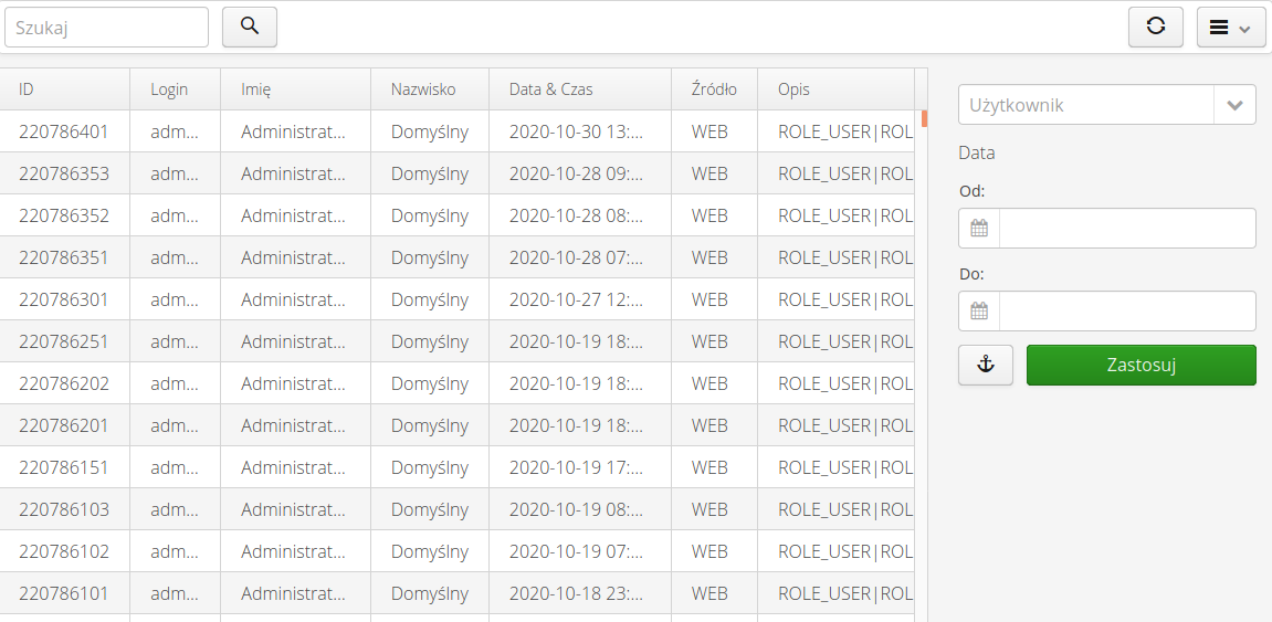
| Restoring the view of the un-docked filter is possible by reloading the view/page. |
Notifications
Notifications are notifications in the system that convey important information to the user. By default, system buttons are available in the upper right corner of the interface. One of them is the bell button. By default, it has a standard appearance. This means that no notifications are waiting for the user.
When notifications of a new event appear in the system, the button is decorated with an overlay in which the number indicates unapproved notifications.

Activating this button brings up a list of notifications in the side panel.
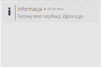
| Notifications as long as they are not deleted by the user will appear in the notification field. Only closing a notification marks the notification as confirmed. This is also saved in the system. |
To delete/confirm a notification, close it via the confirmation button visible after hovering over the notification. Closing a notification means confirming that it has been read.

At the bottom of the notification window are buttons for deleting all notifications and closing the window. Selecting delete will remove all notifications and confirm them.

| Notifications during their creation in the system can have a specific expiration date, after which they themselves will be saved as confirmed automatically and disappear from the queue for notification. In addition, if the number of unconfirmed notifications for a given user exceeds 50, a reminder about pending notifications to be confirmed will be displayed to the user every time these data are refreshed. |
For the administrator with access to the configuration section, it is possible to view all notifications in the system, including information when a given user has hidden/read a given message. See the setup help for information about this view.
AMAGE Helpdesk
Systems made available on the platform managed by AMAGE can be equipped with access to the Helpdesk platform, which allows you to create support requests directly from the application. The action is available in the help menu Report a problem. After it is called, a window appears that displays information about the request.
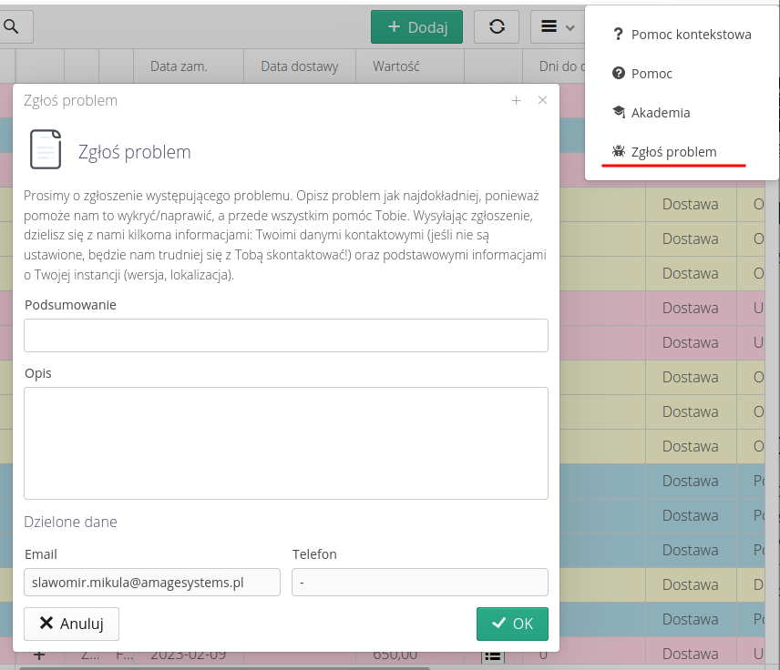
The create ticket window allows you to enter your problem/request for help and leave your contact information. Once saved, the request is redirected to the AMAGE support team.
| The HelpDesk system is available to all users of the system and allows the AMAGE team to react quickly. Unfortunately, this system is not always enabled. In the case of installation of AMAGE systems at the customer’s location (On-Premises), the installation may not have access to external AMAGE servers and this function is disabled. Support can always be contacted through the general channels available on the website. |
Mobile application
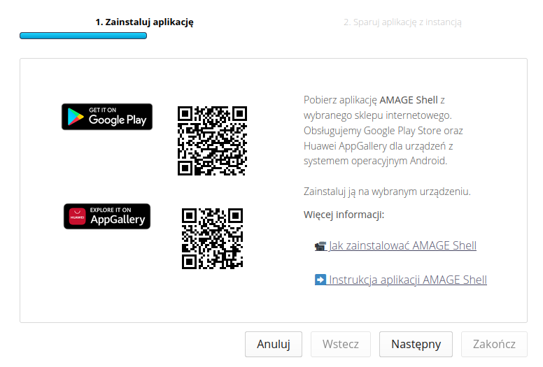
The AMAGE Shell mobile application is an application that facilitates the use of the mobile version of the system. To install it, just run the wizard available in the system menu.

The application is available for the Android platform on two online stores. Google Play Store for most devices with the above-mentioned system and Huawei AppGallery for Huawei devices that do not have the Google store launched by default. Just scan the appropriate code on your phone and install the application.
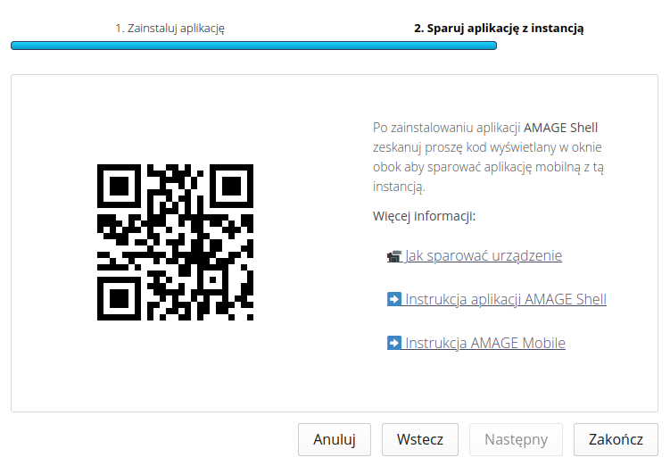
The application during the first launch (in its initial launch wizard) asks to pair it with the selected instance. This is what the second step of this wizard is for. We scan the code displayed there and the application automatically configures all the settings.
| The AMAGE mobile view manual and the AMAGE Shell application manual are available in the documentation portal. |
Browsers
Browsers in the system. They are made available in different places in the application depending on the requirements. They provide data/views common to tools.
Geographic location/plan selector
When starting an instance, the system does not have a specific default location, i.e. the one from which we start. This may be the location of a plant or construction site. In such a case, the system displays a message (for people with appropriate permissions!) allowing you to set this default location.
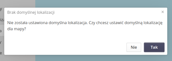
| You can always change the location in the system settings. Refer to the configuration module documentation for this purpose. |
Location selector on geographic maps or defined plans. Where the system allows you to define such a location (location, product, order, contract), a location selector is available. When it is selected, an additional window with a map view appears.
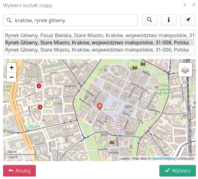
If you have your own definable maps, changing the view (underlay) can be done by selecting the layers icon. Changing the zoom is realized by (+/-) buttons has the map view.
| Selecting a search location is not the same as indicating a location in the selector. You should separately select a place on the map by clicking on the appropriate place. |
The view also allows you to search for a geographic location. If we enter text in the search field and confirm it with the search button, the system will present a list of potential places corresponding to such a search. Each of them is selected by clicking on a given entry.
| To search for places through the search box, the server must have Internet access. To view custom maps, the system must be configured during deployment and custom map plans must be uploaded. These actions are performed during deployment. |
The app also allows you to search for a place by providing geographic coordinates in the form of two numbers, such as "50.125 20.195".
The current geographic position can be obtained by clicking on the next pointer button. It is required to add permissions in the browser to access location data. After permission, we have the opportunity to specify our location.
| Location on a computer (laptop, etc.) may be inaccurate as it uses general location mechanisms NOT using GPS mechanisms. The application launched on the phone/tablet will be able to determine the location more precisely if precise location is turned on. |
Additional internal viewers are a PDF document viewer and an image viewer. Other documents are opened by the system with the default applications available on the user’s computer.
Object selectors
Object selectors are available in various places in the system. They allow you to select, in a given context, the object necessary to further specify the actions being performed.
Selection from the list
In the case of objects that are presented in the form of a list, it is possible to select using a general selector.
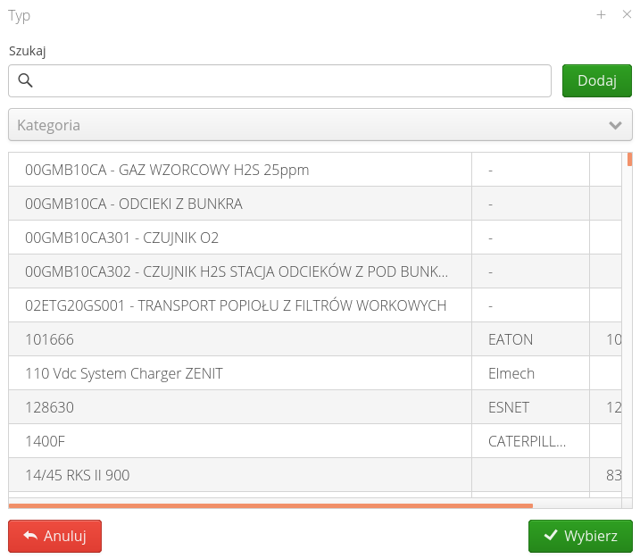
The selector may have a different configuration of columns and filters depending on the selected object. If the system/permissions allow it, the system allows you to add a given object directly from the search field. This can significantly speed up the work in the system.
Selection from the tree
For objects that are represented in the form of a tree, the system presents object selection using a viewer specifically for this type of data.
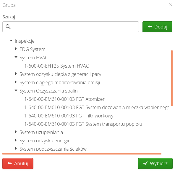
In the case of selection lists in the form of a tree, the mechanism for adding new elements takes into account the current selection. If no element is selected, then adding will create a new object in the root place. If any object is selected, the new object (e.g. location) will be placed as its child.
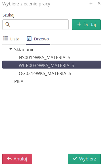
| In case it is possible to represent elements in the form of both a tree and a list, the system provides such a function. Tabs appear in the selector view that allow you to select an item either from the tree or from the list. |
Identifiers
Using it, we can add identifiers manually or by scanning using a code scanner attached to the computer. The ID form remembers the last selected ID type and uses it as the default the next time the form is opened by a given user.
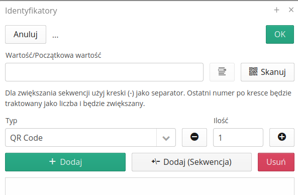
Information identifying objects
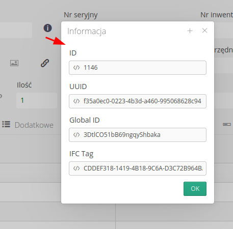
An (I) information button appears in most object detail windows or edit dialogs. After pressing this button, a window appears that displays all unique identifiers of a given object. They are always a local identifier from the database and a unique identifier (UUID) generated in the AMAGE system. In addition, if an object comes from e.g. an import from a BIM/IFC system, it may contain additional information fields such as GlobalId or IFC Tag. This window allows you to use this ID to create scripts or external integrations.
Attachments
In the system, in many places and facilities, it is possible to attach external files (photos, documentation). These elements are included as the so-called attachments. Every object in the system that supports attachments has a list of attachments in its details. The attachment view allows you to view information about them and perform basic operations such as attaching/removing attachments.

In each row of the view we can:
-
Attachment preview - an internal viewer is available for image and PDF files
-
Context menu - allows you to assign a category to selected attachments or specify the public view of the attachment
-
Download - downloads the attachment. ATTENTION. Permission required for pop-up windows in web browser.
-
Detailed information - detailed information about the upload date, checksum, ID, etc.
-
Attachment versions - access to the attachment version view.
In the case of elements related to a given object, e.g. in the case of assets it will be the type of elements - it is the object that defines the type of a given asset, we have the option of additionally viewing in one view all attachments from the object and related objects. Then an additional filter Source appears, with which we have the possibility to select the source of attachments.
|

After selecting the attachment version button:

The attachment version window appears. This functionality allows you to upload subsequent versions of the same attachment to the system. Using the 'Upload' button, you can load a new version of this attachment into the system. A new file is uploaded and the information in the main data of the attachment is updated.
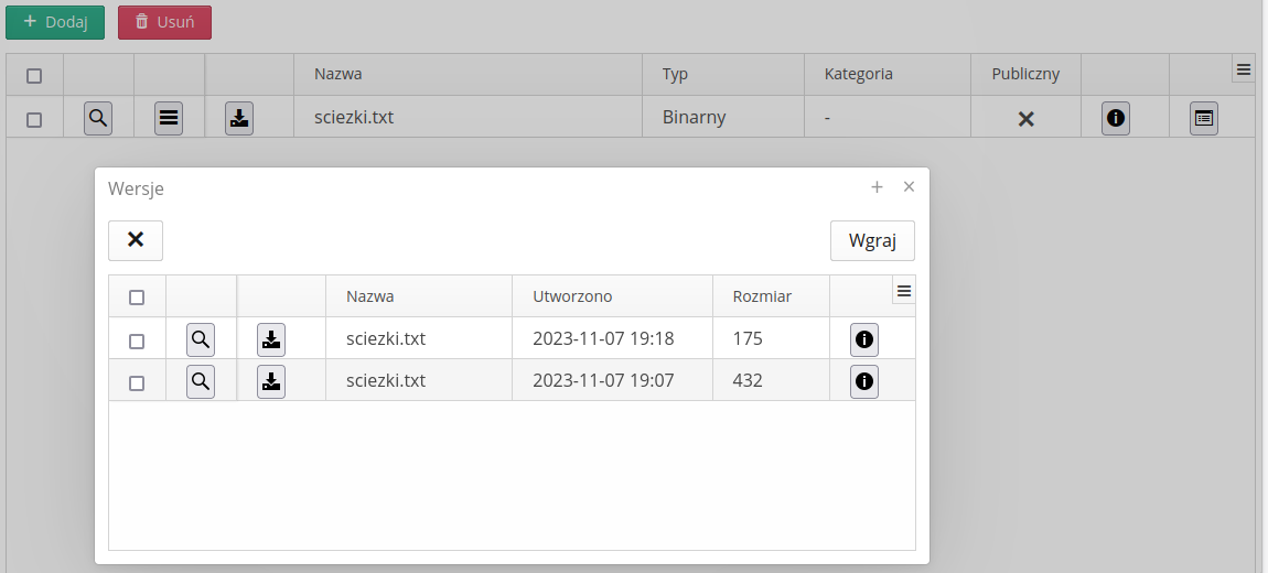
| There is always the latest version of the attachment in the main attachment view in the sharing system. After uploading a new version, it becomes the default version. Older versions of an attachment can always be downloaded from the version view. |
The ability to upload files by dragging files from local drives has been added to the file uploading interface. You can upload these files both via Drag & Drop and by selecting the files using the operating system selector.

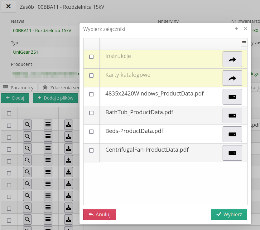
Attachment views also include an additional button that allows you to attach files not only from the user’s local disk, but also those that have been uploaded to the system and stored in the directory structure to a given object (resource, parameter, document).
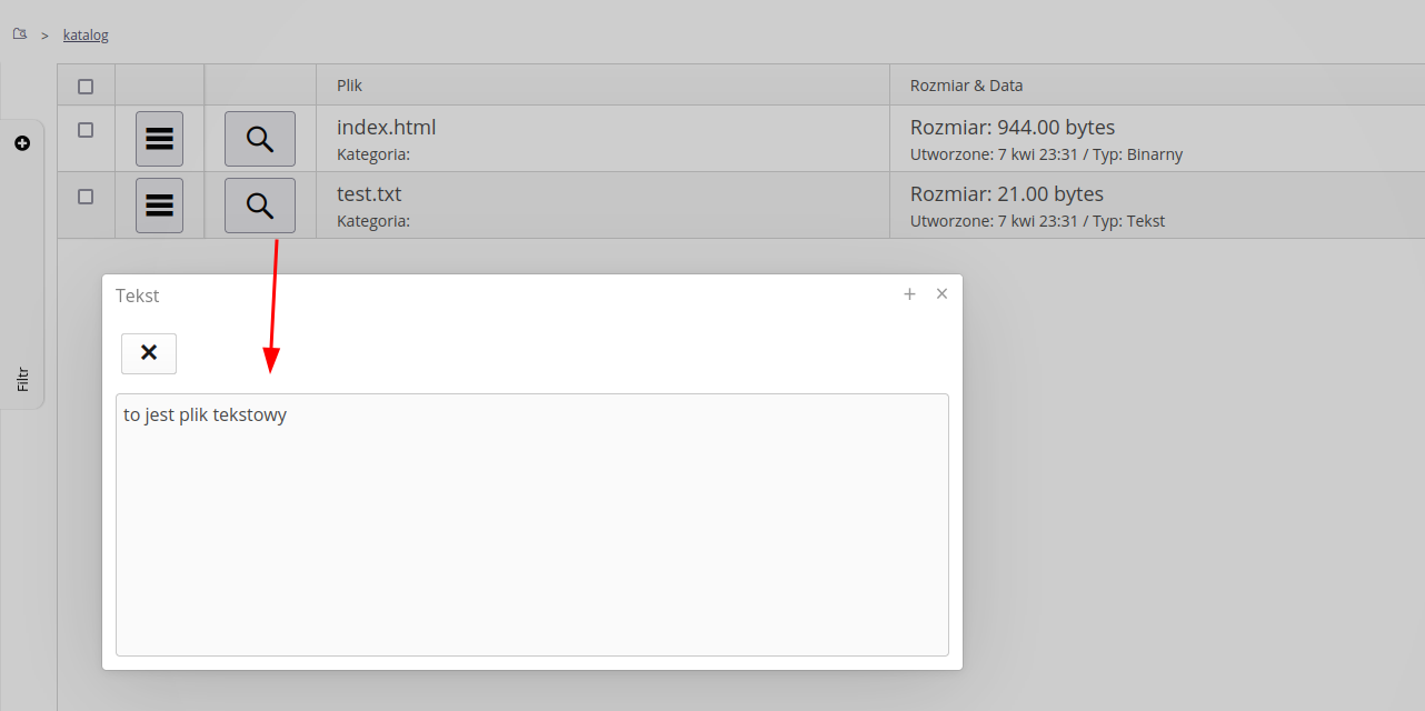
In the application for files such as: image, PDF, text, html, the system provides default browsers in the main interface:
Editors
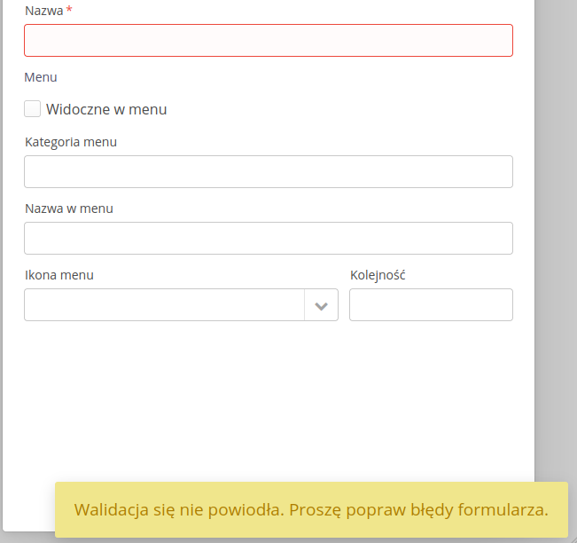
Editors allow you to enter and configure objects in the system. Depending on the type of object, the editors may differ. However, all editors have some common elements. These are: save, cancel changes, save and close the edit window buttons. Each editor also has its own mechanisms for checking the correctness of the entered data and its completeness. In case of errors, the system displays appropriate messages and marks incorrect/missing elements with an appropriate border and an additional message. A message about the need to correct the data also appears in the bottom bar.
Each selectable element, e.g. employee selection, may have an additional button to delete the selection. Once selected, the item is removed from the list of selected items. Only optional items have this option. Additionally, in the system, each button has its own additional description, which appears when you hover the cursor over it. This is the so-called tooltip. This is especially useful when the button does not have a visible description.

Authorization
The system allows you to create users by inviting them with their email addresses. This allows information to be sent to these users from the so-called authorization token. Only with this link or token can the user set their own password to log in to the system and thus gain access to the system.
The functionality of the invitation is described in the section regarding users and the main tool menu. Here we only describe the views and information displayed during password procedures.
New user - create a password
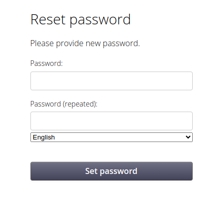
After receiving the invitation email, the user can click on the prepared link with the token. He is taken to a window where he can set his new password. Here, when logging in for the first time, you can change the language in which further messages are displayed. Once the password is approved, it is saved for the user.
| The account activation link is valid only for 7 days from the moment it is generated. After this time, the link is no longer valid and the user will receive an appropriate message if he tries to use it. |
| When setting passwords for new (and existing) users, the system applies security policies to passwords if they were created in the system configuration (password length, character usage, etc.). |
Password reset
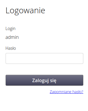
There is always the option (for local users) to reset your password. If you forget your password to log in to the system, follow the steps to change your password. After entering the correct login on the start page, we are redirected to the password entry window. A 'Forgot password?' link appears below, which allows you to proceed to the password reset procedure.
A window appears that allows you to enter your email address. After entering it correctly, a password reset link is sent to the provided address. The procedure is similar to that of logging into the system for the first time.
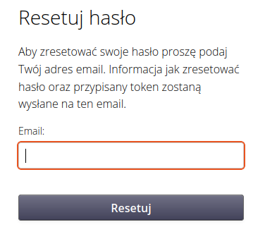
| To reset a password using this method, the user must have an email address specified in the system. |
Inviting users
Users can be invited to the system through a simple interface in which we enter e-mail addresses and, optionally, an additional message for them. They will be sent an email with an activation link. For details, refer to the User Configuration section where this feature is described in more detail.
Direct login
If the system is configured and linked to external authorization sources such as Azure AD/Google/Oauth2, etc., links for direct login through these systems are provided. This allows integration with parent applications and provides full SSO (Single-Sign-On) login without having to enter the login in the initial window. Depending on your system configuration, use the following addresses:
-
/login_azure - login via Microsoft Azure AD (Entra ID)
-
/login_keycloak - login via Keycloak OAuth
-
/login_auth - login via the AMAGE central authorization server
Error messages
Errors occur in every application. The AMAGE system displays error messages in a dialog box. Production versions display a general error message, while beta versions display a detailed error message.
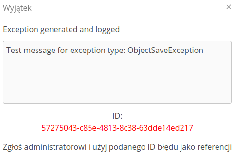
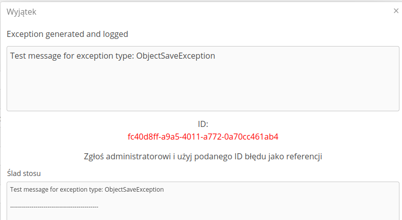
| Production systems with active support services are monitored on an ongoing basis and if errors occur, they are recorded in system logs. The AMAGE team responds to error reports on an ongoing basis and fixes them as soon as possible. |
Instance archive mode
AMAGE system instances that have completed their active mode of operation, e.g. construction has been completed, may still be available to users, but in archive mode. Archive mode allows users to view data, but does not allow them to make changes to the data. Archive instances of the AMAGE system are identified by the corresponding information when you log in to them. Information about the operation of the instance in archive mode appears at the bottom of the screen. Archive mode allows you to view the contents of the instance, but does not allow you to make changes to the data.

Deletion of records
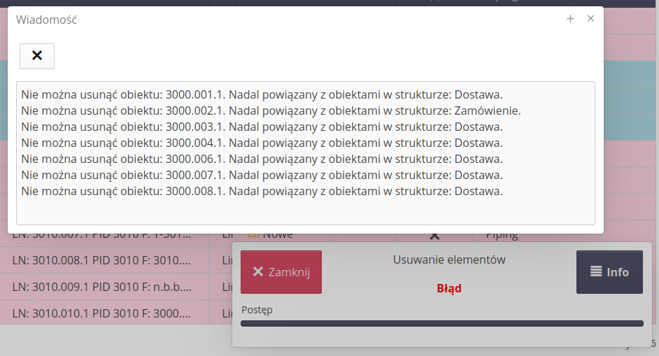
During deletion, additional security measures are introduced in the system. After selecting the Delete action for any object in the system, an additional record deletion progress window appears. The progress bar updates continuously while records are being deleted. In the case of successful deletion, the window closes automatically. In the case of deletion errors, the window remains visible, and the Info button is enabled, which allows us to display a detailed message about deletion conflicts.
| The system checks all the links of the deleted record and stops deleting the given record in case of conflicts. This makes it easier to properly clean the database from all the dependencies. |

